- 首页
- International
- 艾特奖
- 文化节
- 服务体系
-
网站导航
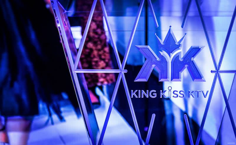
项目名称:KINGKISS KTV
Project Name:KINGKISS KTV
设计类型:娱乐空间
Project Type:Entertainment space
项目地点:重庆市
Site Address :Chongqing, China
设计机构:加拿大立方体设计事务所
Design firm: SPACE³ Interior Design
设计师:徐麟
Designer:Xu Lin
摄影师:钟永钢
Photography:Zhong Yonggang
项目面积:2400平方米
Total square footage: 2400sqm
项目造价:800万
Project cost:8 million
主要材料:数码光条,黑色理石、发纹不锈钢、吸膜玻璃、LED
Architectural materials:Digital light bar、Black marble、Hairline pattern stainless steel、Film absorbing glass、LED
竣工时间:2018年8月
Completion date:August 2018
随着大众审美的逐渐成熟以及新新人类的推陈出新,凸显自我、张扬个性的前卫、轻奢风格,已成为当今娱乐空间前沿风格。大胆“好色”的色彩语汇,以及“软硬兼施”的材料搭配,无不让人在冰冷中寻求到一种超现实的平衡。
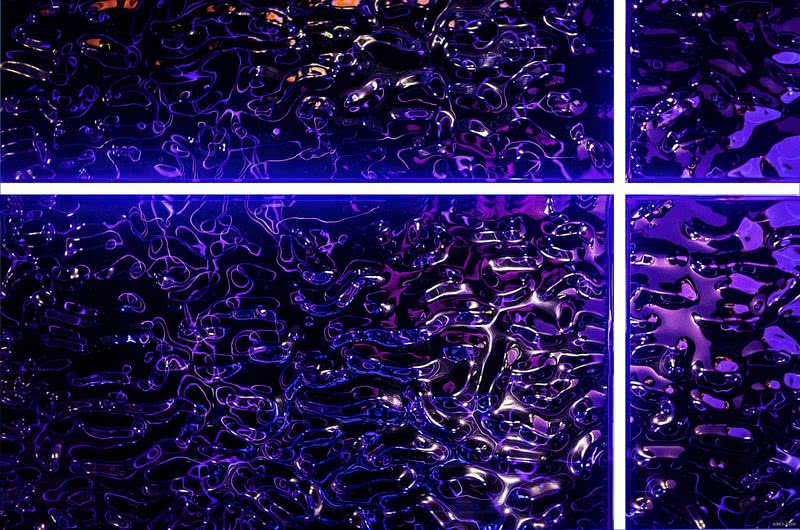
步入大堂,大面积连绵凹凸的金属波浪板天花让人耳目一新,设计师通过对几何造型建筑感与极简美学的探索与表达,用有趣的思考演化成独特的空间氛围。规避欧式厚重感,却并没有随意迎合极简风格的高冷感,一个特立独行轻奢时尚的空间应际而生。不锈钢弧形造型贯穿纵向走廊空间,连续、简约,形成了一个节奏感、视觉穿透性更强的感官效果,数码光条的截面运用更是塑造了整条走廊的递进节奏。湖蓝墙砖与红色FENDI装置的搭配,完美的融合了轻奢的美感。
品质轻奢,不单单是奢华的装饰元素,而是设计师内在的学习沉淀。试着放慢脚步,抱着赞赏的态度和深沉的思考去享受当下的人生,这是我认为最纯粹的轻奢美学。
The light of the day knows that not only the depth of the night.
With the gradual maturity of the public aesthetic and the innovation of new and new people. The avant-garde and light luxury style that highlights the self and individuality, which have become the frontier style of today's entertainment space. Bold "lascivious" color vocabulary, as well as "hard and soft" material collocation, these all let a person find a surreal balance in the cold.
Entering the lobby, the large area of continuous concave and convex metal corrugated ceiling is refreshing. Through the exploration and expression of geometric modeling architectural sense and minimalist aesthetics, the designer has evolved into a unique space atmosphere with interesting thinking. To avoid the European heavy sense, but it did not cater to the minimalist style of high cold sense. In turn, a maverick light luxury fashion space should be born. Stainless steel arc shape runs through the longitudinal corridor space, it is continuous and simple, which are forming a sense of rhythm, the visual penetration of a stronger sensory effect. The use of digital light bar section is to shape the progressive rhythm of the entire corridor. The collocation of blue wall brick and red FENDI device perfectly integrated the beauty of light luxury.
Quality light luxury is not the only luxury decoration elements, but it is also the designer's internal learning precipitation. Let us try to slow down and enjoy the present life with an attitude of appreciation and deep thinking, which I think is the purest luxury aesthetics.

